Find a Preschool
A web app to help parents find the right preschool
Problem
Finding a preschool is a daunting task for new parents.
New parents in cities like San Francisco often hear they should get on preschool wait lists before their child is even born.
Research
I consulted with new parents to find out what criteria they look for in a preschool.
I also did online research to look at how preschools market themselves and showcase what they offer.
How might an online platform help parents compare relevant preschools?
I decided to create a tool to help parents find preschools that work with their daily commute.
This a launching point from which they can compare other criteria that are important to them.
Interface
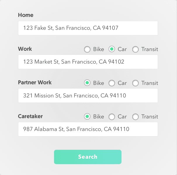
I designed a form for users to input relevant addresses to their daily commute.
I've included work addresses for each parent, as well as an additional caretaker. Knowing how the parents commute is also important in finding schools that work.
Then, I created the landing page around the form.
My aim was to direct the users attention toward the form. I used some copy to help explain what the tool does. I wanted the visual elements to help emphasize that this is for preschools without being distracting.

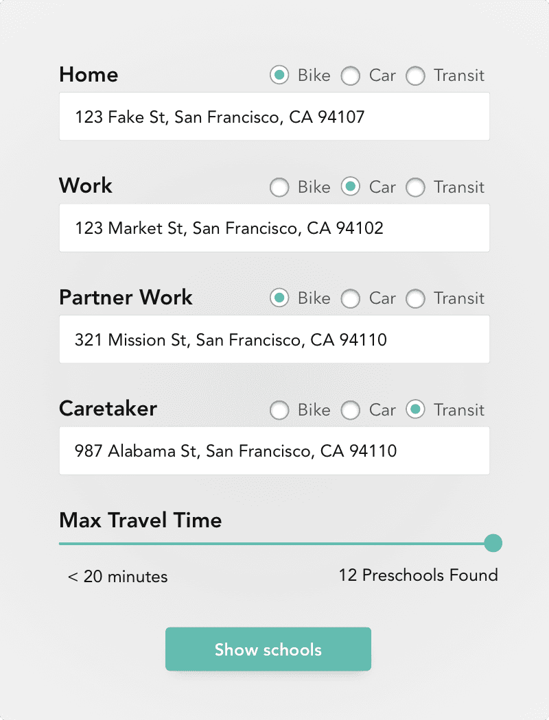
When interacting with the prototype, users wanted to limit the results by travel time.
I decided to make an interactive slider to allow the user to set the distance. Informing the user how many schools are in the chosen radius as they slide, gives helps them make a more informed decision.
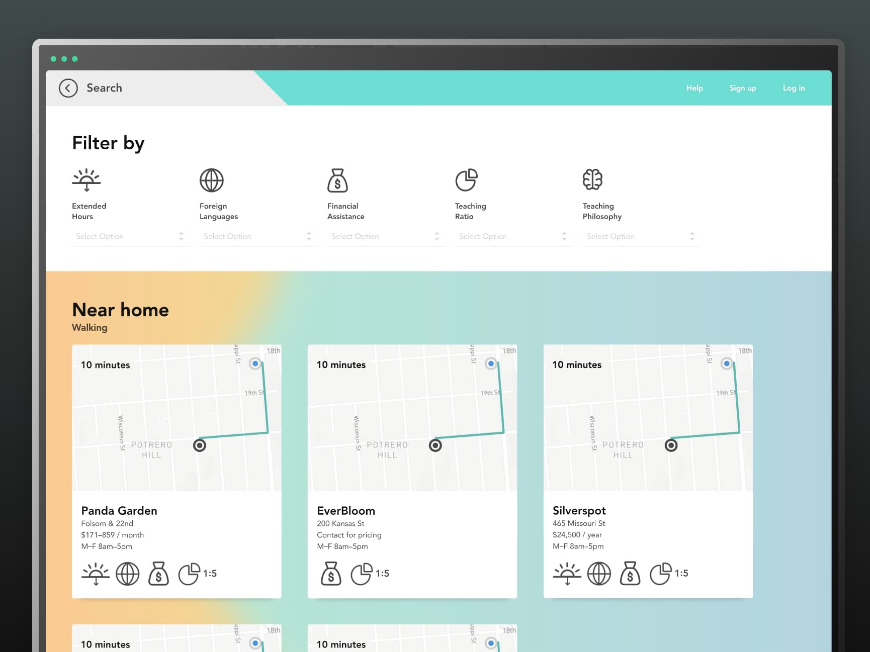
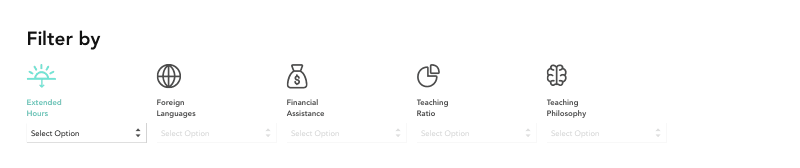
How might we present the collection of preschools in an easily digestible way?
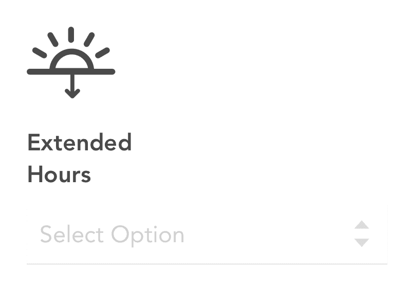
Sketching helped me figure out how to layout all the relevant information on each card. I thought that using icons would help me keep the information digestible.
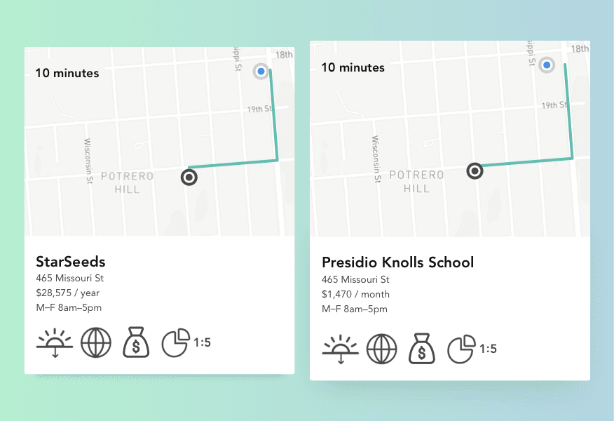
I placed a map on each card to help the user understand exactly where the school is.
Navigating a large map is cumbersome. The user is more concerned with answering questions like: "Is it near my home or work?", "How long will it take to get there?"
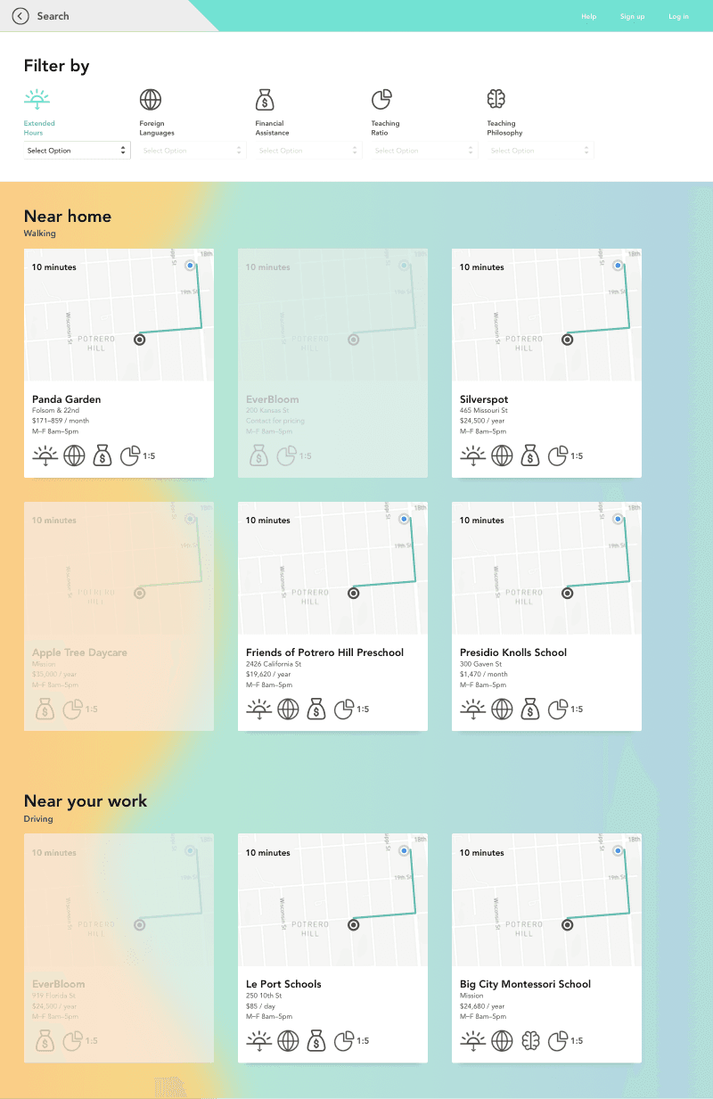
Dimming, instead of removing schools helps parents understand how schools compare.
The filtering menu at the top also serves as a key to the icons so the user can understand their meaning.
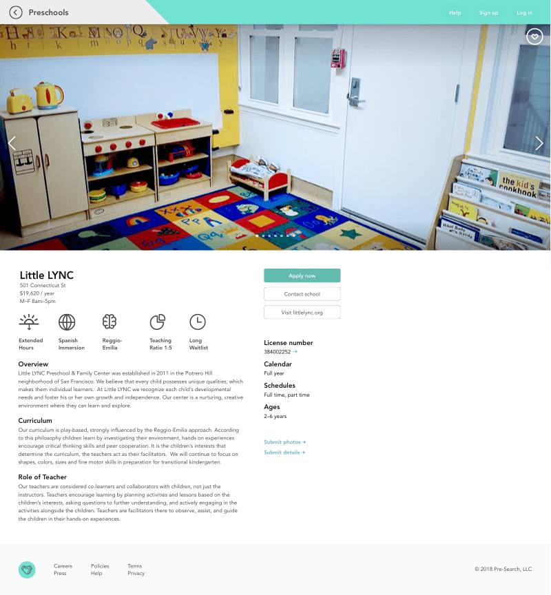
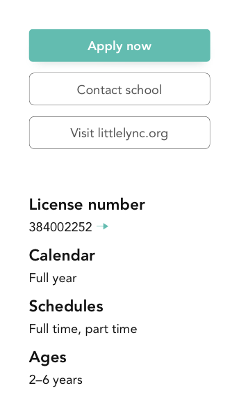
For a deep dive, each school has a more detailed view with a direct link to the application.
Every preschool has a different process. We simplify the experience by linking the user to the application pdf or website. As well as contact information. The license number helps parents have trust that the school is a safe environment for their children.

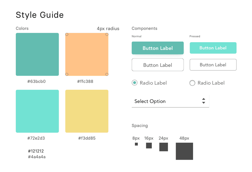
Visual Design
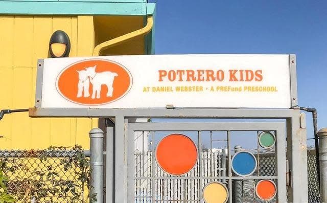
I was inspired by a preschool I walk by daily which uses a green and yellow color scheme.
Green and yellow, both feel educational too me, but in a light-hearted way. I'm not designing for a stuffy prestigious university.
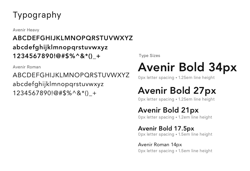
I wanted the typography to feel warm and youthful.
Learnings
- Preschools in cities like San Francisco are so in demand that they have little need for visibility.
- There is a user need for a unified application platform.
- Backgrounds with hard-edged contrasting colors can confuse users (yellow squiggle).